
Different ways to prototype and test a software product as a UX developer.
We will discuss the following methods and techniques and how to best use them:
- Prototyping (overview)
- Fidelities in Prototype
- Low-Fidelity Prototyping
- Paper Prototyping
- Wizard of Oz’ Prototypes
- Medium Fidelity Prototypes
- What is a Good Prototype
- What makes a prototype immersive
- Design and Prototyping in Context
- Ux Prototyping Mistakes
- Prototype Design Goals
- Lean UX Prototyping
- Collaborative Design Workshops
- Putting it to test
- Formative Evaluation
PROTOTYPING
Prototyping is to design for emergent qualities such as ease of use and experience, we need to simulate interaction and assess the experience that emerges. (Many aspects of) ease of use and experience cannot be ‘calculated’ (accurately or reliably enough) in advance.
The main goal of prototyping is to get feedback from experienced stakeholders and colleagues by asking questions and receiving opinions on your design decisions. Prototype is a simulation of computer behaviour, that supports the performance of simulated tasks by simulated end-users.
Prototypes vs Design Design and prototyping are closely integrated. A prototype is a distinctive, useful and insightful description of concerns which lets you analyze ideas early. Where as design can be a specification of computer behaviour that supports thinking by designers and implementation by programmers.
Prototypes vs Probes. Probe is an artefact that inspires reflective adjustment by participants and captures data about their associated adaptive responses. A probe is an instrument that is deployed to gather data about the unknown. A good probe is simple yet flexible, open-ended, adaptable. A diary is a probe.
Fidelities in Prototype
For prototypes, fidelity is defined in terms of simulation of interaction and form.
- Proportion of navigations between containers that are accurately simulated (between page links, hiding and showing windows).
- Proportion of transitions within components that are accurately simulated (onMouseOver, onMouseDown, onMouseClick).
- Proportion of user input actions that are accurately simulated (mouse click, rather than finger press).
- Proportion of form factors that are accurately simulated (a hand-held device is displayed on a fixed monitor).
Accuracy is visual plus temporal characteristics. Is the use going too fast or too slow. There is no need for a “whirligig” progress indicator or animated transition, as well as ‘wrong border colour’.
Designer’s view different levels of fidelity
- high e.g. photoshop plus transparent links, html + css + javascript, coloured, with real text and image medium e.g. interactive wireframe (Axure); e.g. rough interactive wireframe (Balsamiq)
- low e.g paper prototype Every prototype is ‘hi-fidelity’ in some respects, and some ‘hi-fidelity’ prototypes only match look and feel, but the distinction seems to have stuck.
A framework scope transitions between views, transitions within views, transitions within components interaction.
- What proportion of transitions, and kind of transitions, are simulated accurately, in terms of appearance and timing?
- Which Scope Feature 1. Feature 2. Feature N. Physical Form User Actions Primary Method e.g. click Alternative Methods e.g. drag n drop Possible methods? Right click Device Display Display + Input Display + Input + Artefact.
- How many physical features are simulated accurately, in terms of appearance and timing?. Early, few, late. many EARLY LATE feedback from exploration Feedback from walkthrough EARLY LATE.
Low-Fidelity Prototyping
Also known as paper prototyping is good for face to face participation and redesign during a ‘feedback’ session. Start with key pages or moments. Sketch up multiple ways of approaching the problem. Use ‘6 up’ templates initially. Discuss and refine to a preferred option – Use ‘1-up’ template. Animate the interaction manually. Preparing reusable elements e.g. frames on card, and single displays on paper, can speed up prototyping. This sort of work can be laborious, difficult to share and the specification is easily lost in a pile of paper. So pin in on a wall and document with still camera or video.
Examples
Prototyping for Feedback
Aim of feedback session is to state the questions about interaction and experience that you want the session to answer. Is the ‘flip-to-open’ gesture intuitive, discoverable and memorable?. Introduction, participant screening, set context and interact. Ask “Please describe what you see? What you can do from here?. Set a task goal. What action would you take to achieve that? Goal is an outcome (end-state) not a method. Review. Recall the context “Would you like to see anything different on this page”.
Paper Prototyping
Paper prototyping is of mixed variants. Paper prototype can be done on desktop or on sheets of paper later scanned via camera using a mobile. Later, this paper prototype can become interactive using tools like Popapp.
http://www.lynda.com/course20/Web-Interaction-Design-tutorials/Next-steps/133349/146782-4.html
Wizard of Oz’ Prototypes
Human ‘magician’ plays the system ‘back-end’. Magician decides how to interpret the user input and which output to present to the user. Wizard of Oz' prototypes are suitable when technology is not yet available or perfected. E.g. speech input, gesture recognition, Or when application is not yet built. Paper prototyping is ‘wizard of oz’ with low magic.
For example, how would you test ease of use of a new device? A block of wood and paper realises the form and its input controls. Visual feedback is displayed on a laptop screen. A magician sitting behind the participant with a wireless keyboard plays the role of system and navigates to the appropriate screen, according to the participant’s action.
Medium Fidelity Prototypes
Medium fidelity design & prototyping tools include Visio, Adobe Fireworks, Axure (complex). Balsamiq (simpler), Webflow – visual editor and responsive web framework.
www.uxpin.com – the usual wireframe, export interactive preview, distributed annotation and discussion. www.indesign.com – transition between images (screens). Develop in cloud, test on mobile.
What is a Good Prototype
A good prototype is has specification that are met, is unambiguous, accurate to within stated limits, as complete as claimed (supports the tasks) and if present, consistent with styleguide which is easy to read.
A good prototype is a means of getting feedback, sufficient for participant to become immersed in simulation. Experience task performance. Fluidity of behaviour. Focuses the participant upon potential major usability problems. Easy to manage prototype in session.
Protoype should be a basis for collaboration. Easy to share. Easy to access. Easy to use (in the way anticipated). Easy to reference. Of course, supports a great experience. Constitutes progress. Advances from the previous version(s). A good prototype has come a long way and offers a ‘good place from which to continue’.
What makes a prototype immersive
An immersive protoype offers meaningful content and data values, is actual and personal and offers hi-fidelity interactions. Whether the features simulated are the ‘aim of your test’ or not. How can a prototype ‘bias’ the feedback?, hype (soundtrack music, badges), lack of search cues e.g. visual characteristics (colour, shape, grouping etc.).
If you want to get feedback on search tasks, consider using primary and secondary highlights and images in a wireframe, rather than an outline, inaccurate spec. e.g. desktop rather than mobile. Input modality is important.
What is misleading? If you have not designed a property, do not include it, unless participants will notice and/or comment on its absence. Use outlines for unfinished components, not ‘default full style’.
What is disruptive? ‘Obvious’ properties, spelling mistakes, unattractive colour schemes, delays, style inconsistency, visual effects (flashes), non-system elements, like dashed expectations, unrealistic data, absent properties, repeat content.
Design and Prototyping in Context
Storyboards are good design product for showing the anticipated context of use alongside the actual interaction. Video, for the same reason, is a good means for getting feedback from a focus groups, but user connot interact with it.
Field trials can also be employed to get feedback by taking the prototype into the real world. It is difficult to simulate real context in the lab.
Ux Prototyping Mistakes
Beware of high functional prototypes and software engineering prototypes. Your prototype should demonstrate the technical feasibility of an application, and constitute a step towards delivery of the final product. Functional prototypes can be ambiguous, and inconsistent with style, and so may NOT be a specification (a statement of intent).
Another prototyping mistake is when some aspects of interaction are present, but ‘not yet designed’. What is the designed and what is not? The user may asked which may not be suitable for Ux design, as the simulation of the designed/target system is inaccurate, through omission and addition. Ux may need functional prototypes, when valid feedback can only be obtained with live data feeds in actual context of use, or with very high levels of explorability.
Ux may need target content in prototypes for participants to fully immerse into the simulation and to give valid feedback. Draft content is concerned with the meaning of the content, its scope and factual basis, and constitutes a step towards the final content. The target organisation, and presentation, is probably misrepresented. Draft content can be ambiguous, and inconsistent with style.
Prototype Design Goals
The design goal of a prototype is to make information easier to find. As specific as it can be, unambiguous, menu highlighting, as complete as claimed (supports the tasks).
Achieves the aims and major requirements as stated, consistent with styleguide as stated, search box on a tab? (we do not need feedback about that) portrait mode may have been more suitable for a web page. Associated rationale pulls through the analysis, suggests progress, easy to read (as a specification), supports tasks.
As simulation prototypes need to be accurate to within stated limits. Having a little less content than the existing site is fine, however, this information should be sufficient for participant to become immersed in simulation watch cursor and step on. User should be able to achieve their goal. The behaviour should be fluid consisting of steps, focuses the participant upon issues and easy to manage.
When does prototyping finish? When you are confident that the target system may be implemented as intended, and, feedback sessions with the prototype will show that the major usability problems have been identified and eliminated, such that the usability requirements are satisfied.
Lean UX Prototyping
An approach to Ux design popular in start-up project contexts is LEAN DEVELOPMENT. Fail early to succeed later. Identify the assumptions about user needs that are implicit in your prototype. For example, a makeup recommendation app may assume that its users test a ‘look’ weeks before they actually go out for a party – try it in the privacy of your own room, if you like it then buy the new products or clothes, and do it properly the day of the special occasion.
Is this assumption actually true? There may be evidence in user research – some stories perhaps, interview transcripts – but often, the evidence is fragmentary, flawed by bias, or unsupported by theory. So Lean Ux argues we need to test our assumption and see whether they are really true. This Lean approach results in an approach to prototyping that is driven and focussed by, and tied to Ux research – we build the prototype that we need to answer our research questions (which in turn reflect implicit assumptions about users), rather than prototypes that are driven by purely creative intents. List the most important assumptions implicit in the design. Then work out whether the PopApp prototype is sufficient to answer this question. You may need to add features in the app to confirm or disconfirm the hypothesis.
Collaborative Design Workshops
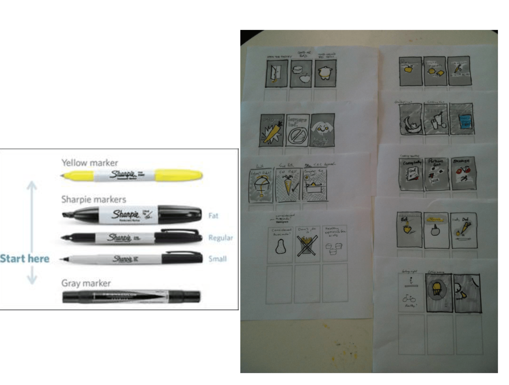
Paper Prototyping can be done in groups. Multiple rounds or iterations may be possible. Later rounds refine the sketch. For version 1, use a thin pen (this is where most people stop). For version 2, go over version 1 with a thicker pen to emphasise structure. Block out some areas in grey to send them back, and others forward. Highlight key areas in yellow.
https://jasonfurnell.wordpress.com/2010/12/01/facilitating-collaborative-design-workshops-a-step-by-step-guide-for-rapidly-creating-a-shared-vision-for-execution/
Putting it to test
Drawing a paper prototype
First collect the preferred options from brainstorming hopefully it will be quite an innovative idea – novel in at least one main respect, and more than an integration of existing apps/services, convenient thought that is. Voice-based interactions, Internet of Things elements (context sensors, embedded computing power, mixed or virtual reality, projected computer output, gestural input are all fairly novel currently) If you are worried that your idea is not innovative enough – relax.
Design Thinking iterations, particularly feedback on early prototypes, but also continued search (such as adopting leading edge digital lifestyles), and ideation, should result in genuine discoveries and realisations – SO WE MAY END UP PURSUING A DIFFERENT, MORE INNOVATIVE IDEA THAN WE HAVE NOW. If you are unhappy, try some of the ideation techniques in.
Give rough form to key moments using templated mobile phone screens. Using the pens, paper, post-its, and scissors provided, create a prototype that will answer your selected questions. It may be a paper prototype, and involve human ‘Wizards’ and actors, or other props to simulate the system and context of use.
Some recommend developing quick and easy prototypes early on – if you work on anything for too long before getting feedback, you may get too attached to one option. The paper prototype should stay true to the wild ideas from brainstorming, but joins them up and makes them more concrete. You should be able to skip through the design stories/user stories that you produced earlier.
Scope and plan your prototype. What must the user experience for your prototype cover to convey the design concept you have? Fill the gaps in the task flow through the paper prototype with extra screens, and make sure that screens include all the information they should. You may need to draw a site map or storyboard to clarify the architecture of your app/website etc.
On DEVICE Better feedback may be obtained, and more informed reflections may arise, from use of your design on the intended device and in the intended context ie on a mobile phone. Download Popapp from marvel.com. Scan or photograph your paper screens. Upload to Popapp. Add navigation links to move between screens Download to your mobile phone. Test ON DEVICE
FORMATIVE EVALUATION
Early Evaluation of Experiences
- Inspection of qualities of Interaction and Experience
- Heuristic evaluation
- Cognitive walkthrough
- Style guide compliance
- Consistency with task and object models
- Usability Testing A method covered in Ux (Systems) a contrast
Evaluative vs Generative Research. Evaluative – how easy to use / memorable etc. is this system? – ‘as is’. Generative – what are we designing for ?--‘to be’. Diary Keeping. Focus groups “Primary” research sources – empirical study of real world. Interviews. Competitive Analysis. Literature Review. “Secondary” research sources – other people’s work. Technology Review.
Valence and CIF are both Evaluative Research. Mostly both have generative opportunities. “Blended” Techniques. Most activities use a combination of techniques to advance a project as far as possible, in the most beneficial direction, with the resources available. Mix and match.
Formative vs Summative Evaluation. Formative: to improve a product. Early (ish). Summative: to compare a product. Late (ish) – compare with intermediate versions to demonstrate progress. A/B – compare with an alternative to demonstrate performance advantage. “Mixed” Methods. Most projects comprise a unique combination of processes to achieve their unique project goal, in their unique project situation, in the most cost-effective way, as they see it. Formative evaluation early on. Summative evaluation later on. Pragmatic vs purist.
Valence Method is more Formative. Valence method has a primarily formative purpose to which are added summative elements. CIF usability testing has a primarily summative purpose and formative elements.
Valence Method. Valence method aims to Evaluate ‘user experience’ (holistic sense of meaningfulness). CIF aims to evaluate ease of use (productivity, efficiency and satisfaction). Valence = positive attraction or negative aversion. Arousal = calming or exciting.
What is Experience?
Hedonic attributes of products are those which influence valence. Which appeal to desire and pleasure and avoidance of boredom. Make products fun, engaging, cool and novel.
Valence Method. Phase I: Exploration. Capture positive and negative feelings during the exploration of an interactive product. Phase II Retrospective Interview. Participants identify the aspect of the product that induced the feeling. Ask ‘Why?’ repeatedly (‘laddering’) to reveal the deep meaning, and fundamental needs that are invoked by the product.
Phase I: Exploration. Ask the participant to: “Explore the product in which ever way suits them best.” And “As you explore, please pay attention to your feelings and continuously indicate all instances of feeling good and feeling bad by pressing a green and red button respectively on a remote control. Be sensitive to your feelings i.e. better to press once to often than not press often enough.
“I will let you explore for about 6 to 8 minutes”. The exploration phase is quite short otherwise memory for actual events will have decayed too much for the Retrospective Review. At the end of the exploration phase, if the participant has not chosen to explore an aspect of the product that is of interest, the moderator explicitly asks the participant to explore that aspect.
“Thank you that was great. Now please can you explore the <product aspect>?’. Make a video-recording of interaction with the product. Ideally, valence markers will be added to the video recording and time-stamped automatically e.g. use Morae and a wiiremote control. If you make the recording with a mobile, you may be able to ‘capture’ a still image, and call out ‘good’ or ‘bad’. Alternatively, ask the participant to touch a red or green card and log the marker manually.
Free Exploration (not directed task performance). Testing under these conditions achieves more pure data – data that is focussed upon the hedonicqualities of interaction (those which bring about positive valence). The participant’s ‘mode of interaction’ affects their experience of a product. When tasks are set, pragmatic qualities of product features AND hedonic qualities enter awareness.
When the participant is free to explore, hedonic qualities ONLY enter awareness. ‘goal-oriented modes of interaction, the product is a means to an end. Users attempt to complete tasks effectively and efficiently - they are ‘serious’, and ‘planning’. Low arousal is preferred and experienced as relaxation when the task is progressing. Should arousal increase, when users encounter usability problems, increased arousal is experienced as ‘frustration’. In ‘activity modes of interaction’, the product is ‘an end in itself’. Users are ‘playful’ and ‘spontaneous’. High arousal is preferred and experienced as excitement. If arousal decreases because of lack of stimulation, it is experienced as boredom.
Phase II: Retrospective Interview. “Now I am going to playback the video-recording of interaction to you. Please watch the video comment on what you were experiencing. We will pause at each good or bad feeling.” Playback the video-recording to the participant. At each valence marker (press on a positive feeling or negative feeling button), pause the video and ask the participant: “Which aspect of the product design caused this feeling?”. It is also important to identify specific product design attributes. For example, if the participant says that a picture caused positive feelings, then ask the participant, “Exactly what is it about that picture that you like?” The answer might be ‘the ocean is so wide’. It is important to identify every product aspect that caused the feeling, so suitable follow-up questions are, “Did any other aspect of the product cause this feeling?”
Use ‘laddering to identify why the product design caused the positive or negative feeling. “Why is it that <specific product feature> is so positive/negative (as appropriate)?” For example, “What is it that the wide ocean is so appealing to you?” If the answer indicates a fundamental need, then questioning can stop. For example, the answer is “it makes me curious. I can explore the ocean and discover new things”, which indicates the need of ‘stimulation’. If the answer indicates a meaningful situation, but the fundamental need is ambiguous, ask why the meaningful situation is so appealing, and so on, until a need is identified. A list of potential fundamental needs is overleaf. Continue, until all the interaction has been reviewed, and markers have been explained.
Needs; self-esteem, autonomy, competence, relatedness, pleasure-stimulation, physical striving, self-actualizing-meaning, security, popularity, influence and money-luxury.
Data Analysis. Tabulate data. Excel with one event per marker, and the following Headers: Participant ID, Marker ID, timestamp, valence type (Positive or Negative), product design aspects, meaning for user, assigned underlying need. Harmonise terminology for product design aspects (not meanings!)
Replace synonyms with consistent terms. Sort and filter to display events (highlights and pain points) that relate to the same product design aspect. Identify the top 10 product design aspects [ed. How –most frequently mentioned? The impact of each event is assumed to be constant, but intensity and influence might be different – first and last impressions are more important?
Some responses are stronger than others (2 clicks positive, rather than 1 click)?. Cites evidence that ‘Happiness is the frequency, not the intensity, of Positive vs Negative affect.’ Assign a need from the list of 11 above.
Dummy data for a promotional website for Smart TVs.
Experience Index: (Positive markers –negative markers) / sum of all markers. Word Clouds.
Limitations? Participants should be first time users. Extensive previous usage reduces the number of markers set. How to collect valence markers in authentic usage situations over extended periods of time?
Ask the participant “Overall, how did you feel towards this product?”. The participant points at a card that represents as a facial expression the emotion they experienced.
Emotion Sampling. Aim: to capture experience duringinteraction (not after). Captures emotional response without the use of commonly-associated representations (words images or gestures) by asking a number of appraisal questions. Did you expect that event to happen?. Did you want that event to happen?. What caused the event to happen? How much control did you have over the event happening?. What was the probability of the event happening?. Did you want the event to stop or continue?. The appraisal questions are presented via a mobile phone and answered when the participant experience a positive or negative event during interaction. Downside is that interaction is interrupted, and can answers to mapped to emotional experiences accurately and consistently.
Measure Desirability with Product Reaction Cards.
Compare and Contrast Valence and CIF
1. SAME - Identify and Explain ‘Extreme’ Moments. Usability: Identify peaks in workload / cognitive effort signalled by error, difficulty, frustration, confusionetc. Experience: Identify peaks in emotional response signalled by facial expressions, biometrics, exclamations etc
2. DIFFERENT – Concurrent vs Retrospective Verbal Protocol. Usability Testing: concurrent as ease of use is not distorted too much by talking aloud. Valence: retrospective as experience is not immediately verbalised. Exploratory vs Task-Oriented mode of interaction (in the sense of global orientation of mental life).