
Want to receive post like these in your inbox? You can subscribe! It's free.
The best part about SwiftUI is that for developers it enables us to move at a lightning speed which means we can spend more time thinking about the user experience and design side of the things and build better products.
I personally enjoy thinking about the connection between the customer experience team and what they want to create and what the experience can be and what is the underlying architecture that could make all of that happen, there is something fantastic about this blend.
User experience
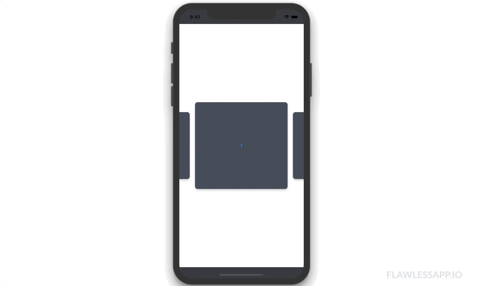
Carousel is a very common user experience that can be seen on almost every top application like Facebook, Instagram and SnapChat. However, a carousel that snaps into place when scrolled is something non trivial.
Carousels are horizontal lists of card shaped items and are used to display eye catching data. Great for customer engagement and retention. To build them in SwiftUI it is as easy as wrapping an `HStack` inside a `ScrollView`, however, what may get you thinking is when you want to snap each item inside the list onto the screen.
Today I will be walking you through my development process of building the underlying architecture of a snapping carousel in SwiftUI. Maybe it is an over engineered reinvention of the wheel but I enjoyed the process so here it goes.
Core problem
There are two core problems with SwiftUI when building a snapping carousel
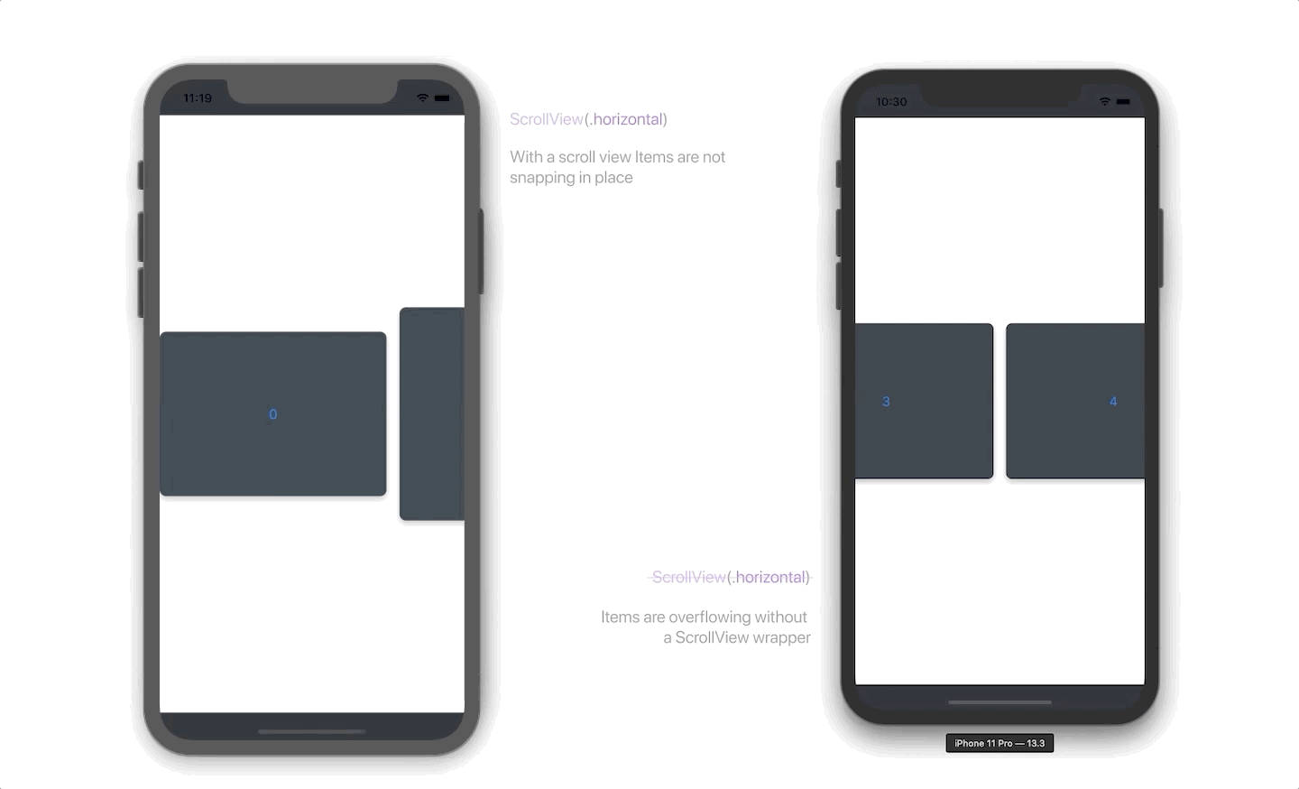
- SwiftUI doesn’t allow much control on the ScrollView wrapper that it provides. Modifying the ScrollView to support snapping was out of question.
- If a HStack is not wrapped by a ScrollView the elements inside will overflow on the screen and you cannot align them using a built in property.
Before anything I did my research like any sane person would but couldn’t find any concrete answers to these problems. The only thing I found was this question on stack overflow and the developer bailed out by dropping down to UIKit. Something, I didn’t wanted to do this time.
First thing first
It was evident that we cannot use the built in scroll view and modify its behavior to achieve the desired results, instead, implementing a custom scroller with gestures was the way to go. However first, there was a need to fix the overflowing HStack items and align the first item on the leading edge.
For this I experimented with GeometryReader and AlignmentGuides but to no avail. Horizontal containers (HStack) only support vertical alignments. GeometryReader doesn’t take into account any offsets or spacing.
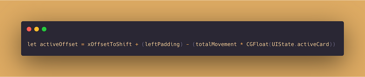
It was quite clear that the x-offset of the HStack was suppose to be moved to a number which will perfectly align the first item to the leading edge of the screen no matter how many items there are in the list. The only bad news, I couldn’t for the sake of love figure this number out. It took me hours when it struck me. The HStack must be center aligned. To better illustrate what I imagined let’s look at the drawing board.
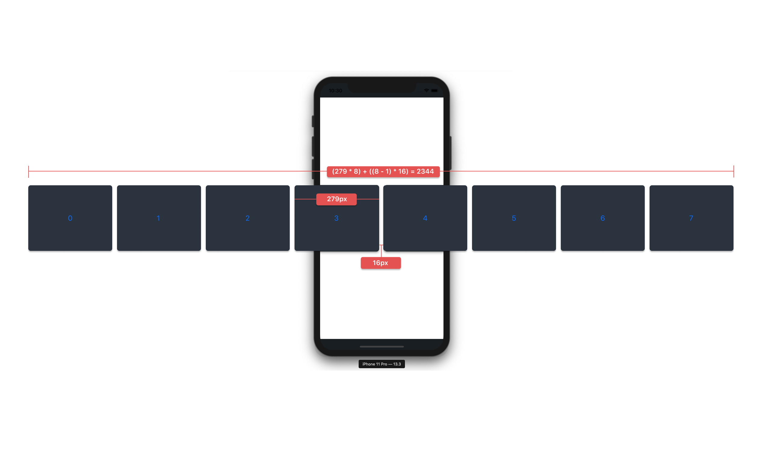
If the list is centered aligned it will have equally overflowing items on the both side of the screen. If someone could calculate the total width of the HStack they can find out how much the list is overflowing on each side of the screen.
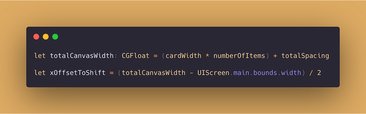
The x-offset will then be shifted exactly how much the list is overflowing. To obtain this number subtracting the screen width from the total width of the HStack and dividing the result by 2 will give the value. Like this:
Aha! It worked. The first item in the list is now perfectly aligned to the leading edge no matter how many items there are in the list. Perfect!
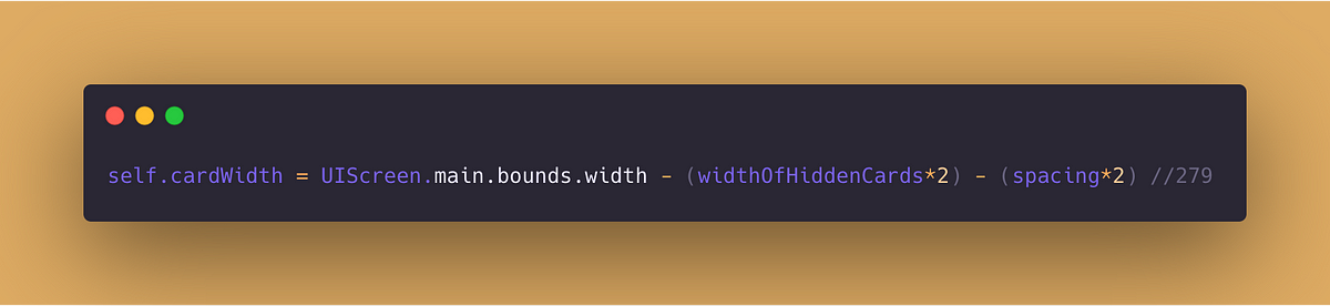
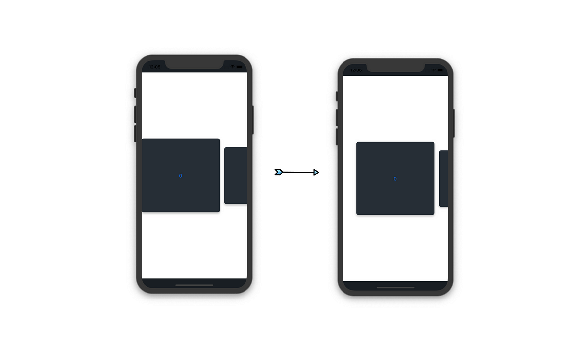
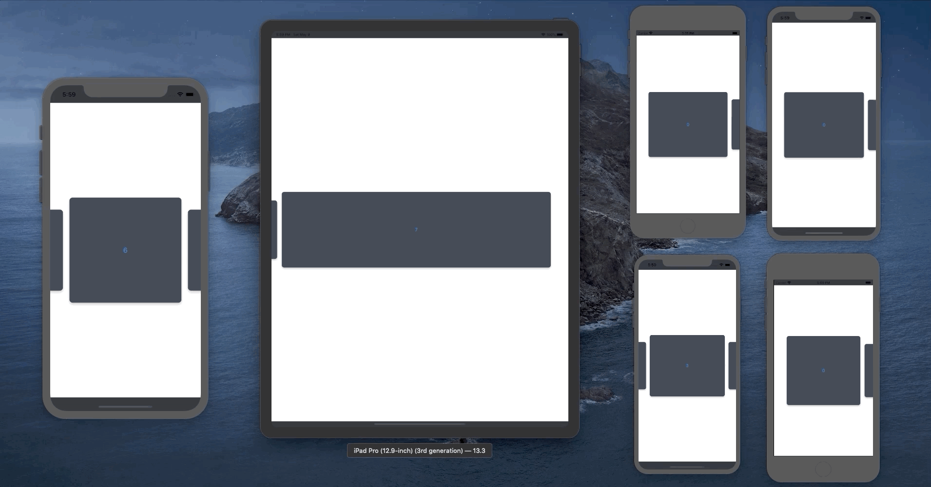
One thing to keep in mind is that iPhone11 Pro screen width is 375, where as on iPhone11 and iPhone11 Pro Max the screen width is 414. Which means the card width must conform to the difference. For this reason there is a need to calculate the card width based on the screen size rather than a constant value.
Snapping
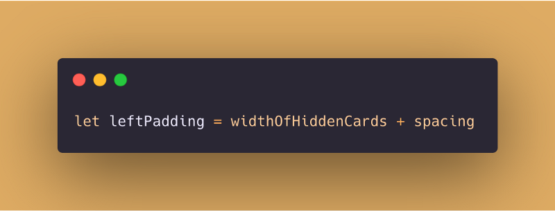
Next step is to start snapping the next or previous item in the center of the screen when the active card is switched, but first, there is a need to add left spacing to the first item.
This padding would be the width of a hidden card and the spacing between the items.
Great! Now all that is remaining is to figure out the total movement we need to perform in terms of x-offset in order to bring in the next or previous card perfectly in the center.
For this, lets think of what exactly we need to move on the screen. We need to move the active card, its padding and the hidden item. Although, note that we are not completely removing the card from the screen. Which means the hidden item remains on the screen in shape of the previous card so it gets added back to the sum along with its spacing.
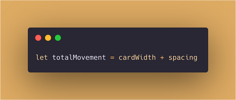
Multiply this by the active card index and the snapping carousal is functioning.
All we need now is to add drag gesture recognizer and start switching the cards by adding or subtracting to the activeCard property based on the translation.
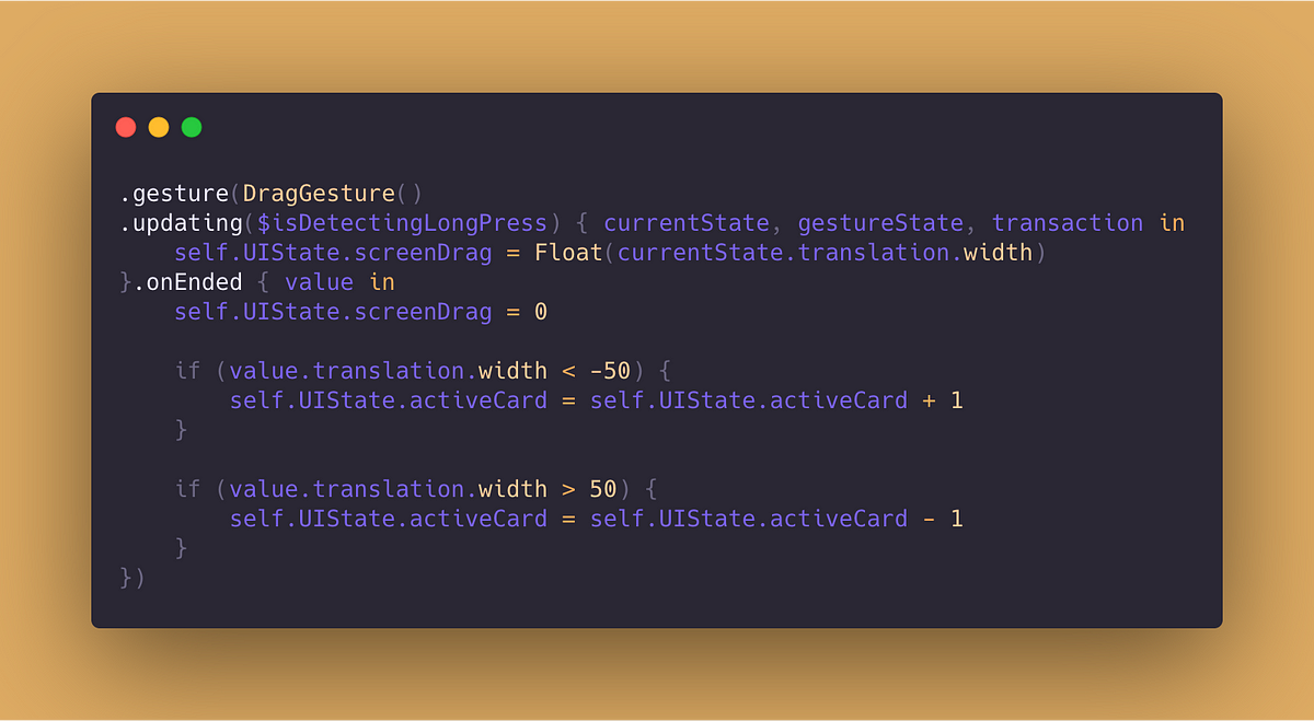
We could also add the screenDrag in the calculated offset until the calculated offset is equals to next offset to achieve card dragging functionality.
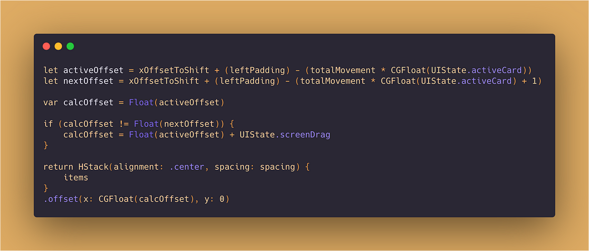
And this is almost everything we need to put together a robust snapping carousal that doesn’t break on different screen sizes.
Result
A final version of the code is uploaded as a gist on github for you guys to checkout and comment on. Maybe there is a better way to do this. Maybe I missed something important! There is much more to learn about SwiftUI and programming in general and I would love to hear your thoughts!